 We’ve all done it. Stood in line at the DMV, imagining the clerk rolling her eyes as she listens to the person ahead of us stumble through the vision test. Meanwhile, we’re hoping to memorize enough letters so we sound more confident than the poor fellow ahead of us does.
Or at the very least so we don’t have to wear glasses in our license photo, which looks lame enough already.
Blame that knot in your stomach on one Herman Snelling. No point in my seeking retribution, however. Snelling is beyond it. But he is responsible for our being brought to our knees by the humble sentence that beings, “E-F-O-T-P.”
Back in 1862, Snelling, a Dutch opthalmologist, invented the modern eye chart.
Snellen wasn’t only insidious, he was clever. He blamed his choices on science.
You don’t have to be paranoid—although it occasionally helps—to believe those eye chart letters were chosen to embarrass us.
Out of 26 letters and 10 digits, why are only a handful used on an eye chart? And why didn’t he toss in a few that we’d have no trouble with, just to make us feel good?
Snellen wasn’t only insidious, he was clever. He blamed his choices on science.
Using a chart to test visual acuity wasn’t Snellen’s idea. The eye chart dates back to 1834 and a German opthalmologist named Heinrich Georg Küchler.
While Küchler used pictures instead of letters, which no doubt felt warm and friendly, people weren’t ready to squint at birds, trees, and farm implements. His work was ahead of its time and it largely went—pardon the pun—unnoticed.
If Snellen was thinking about how humbling his eye chart would be he didn’t let on. He insisted his only interest was in fixing the problems created by series of vision tests published by Küchler’s successor, Eduard von Jaeger.
By 1854, Jaeger had patients reading a series of passages culled from books. Each passage was set in a smaller type font than the passage above it.
While we can muse over whether Jaeger was the first doctor to offer his patients something to read in his office, the efficacy of his tests fell prey to the lack of quality control in mid-1800s print shops.
The consistency of Jaeger’s samples—and the value of any measurements—varied as much as the skill of people who were familiar with inks and paper but not with vision and optics.
And if a patient’s reading ability was better than her vision she could often recite words and phrases she couldn’t see simply by recognizing their context.
Snellen had a solution: a chart of context-free symbols printed to mathematical specifications that could be exactly reproduced regardless of the vagaries of printers, presses, and type fonts.
He called his symbols optotypes, and for the first time, ophthalmologists had a scientifically-constructed standard on which to base their measurements.
Snellen had to abandon his first choice for optotypes, random shapes, when he discovered that too many patients saw the shapes correctly but were unable to describe them accurately. That’s when he switched to letters and numbers. Or what look like letters and numbers when we’re struggling to sort out an F from an E.
Or is it a P from a D?
Those letters and numbers were also optotypes, “…designed using a simple geometry in which the weight of the lines is equal to the negative [white] space between lines [and the] height and width of [the] optotype is five times the thickness of the line weight.”
As I said earlier, science.
Snellen didn’t even leave the height of his optotypes to chance. They’re measured in the degrees they occupy in our field of vision, because degrees are more accurate than inches when dealing with the optical system of the eye.
He decided that acceptable vision was the ability to read an optotype that occupies a 5 minute arc (1/12th of a degree) at a distance of 20 feet. Optotypes that meet that definition form the 20/20 line on the eye chart.
I’m all for science, but Snellen went too far. He used it to determine the most embarrasing characters, although he might have refered to them as the most useful.
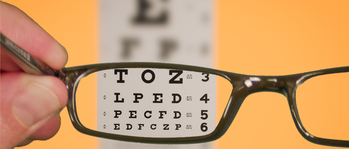
He began with 19 letters and three digits but eventually settled on C, D, E, F, L, O, P, T, Z. They had combinations of horizontal, vertical, and diagonal lines that helped test both acuity and astigmatism.
(Or, taking paranoia into account, because they gave his patients the most difficulty.)
Over the years there have been several refinements to the Snellen chart. None, however, have made it easier for us to distinguish an F from a T.
Much to the amusement of agents at the D-M-V.
Start your Sunday with a laugh. Read the Sunday Funnies, fresh humor from The Out Of My Mind Blog. Subscribe now and you'll never miss a post.
Mind Doodle…
According to quora.com, the highest human visual acuity ever recorded belongs to an unnamed Aborigine man. It was measured as 20/5, meaning he could read at a distance of 20 feet what someone with normal vision could only read from 5. Quite a sight.
Learned something today. Now I can spend the rest of the day watching the Kardasians.
Hi Paul…
That’s exactly the kind of mind-expaning curiosity I was hoping to inspire.
— jay